SDC in Drupal core
Finally, Drupal 10.1 standardizes the way to build components. Let's see how to use them and how to integrate them with WebProfiler.
Disclaimer: Our Tech Blog is a showcase of the amazing talent and personal interests of our team. While the content is reviewed for accuracy, each article is a personal expression of their interests and reflects their unique style. Welcome to our playground!

Introduction
There are a lot of contributed modules to build and manage a Drupal theme using components, but none of them has ever been elected as the de facto standard.
However, things have changed with the release of Drupal 10.1 in June 2023. A specific implementation was chosen for inclusion in the Drupal core. Initially developed as a contributed module named Component Libraries: Components, this functionality has been merged into Drupal core as the new SDC experimental module.
What is SDC?
SDC stands for Single Directory Components. It is a way to organize components in a single directory instead of splitting them across different folders. This approach is similar to the one used by React and Vue.js.
The main advantage of this solution is that it is easier to find the code that describes a component. It also simplifies the process of creating a new component, as you just need to create a new folder and add a some files to it.
Finally, it is easier to share components between different projects, as you can just copy the component folder from one project to another (SDC then allows you to override assets like CSS and JavaScript to adapt the component to the design system of the new project).
How to use SDC?
The simplest example we can think of is a button component, but let’s try to complicate things a bit by adding some JavaScript and an image.
The first step is to enable the SDC experimental module. Then you need to create a new folder named components in the theme folder or in one of your custom modules (yes, you can have more than one components folder). Those folders contain all the components that will be available in your theme.
The second step is to define a new component. Create a new folder named button in the components folder. This folder will contain all the files related to the button component.
Next, you’ll find the code for those files:
button.component.yml: metadata of the component (name, description, props, etc.)button.twig: Twig code of the componentbutton.css: CSS code of the componentbutton.js: JavaScript code of the componenticons/cog.svg: cog iconREADME.md: component’s documentation
Note how all the files related to the component are named after the component itself, this is mandatory to allow Drupal to automatically declare a library for the component.
Let’s start with button.component.yml:
'$schema': 'https://git.drupalcode.org/project/drupal/-/raw/10.1.x/core/modules/sdc/src/metadata.schema.json'
name: button
status: stable
description: A simple button
libraryOverrides:
  dependencies:
    - core/once
props:
  type: object
  properties:
    title:
      type: string
      title: title
      description: Button title
      examples:
        - 'Click me'
    type:
      type: string
      title: Type
      description: Button type
      examples:
        - 'primary'
    icon:
      type: string
      title: Icon
      description: Button icon
      examples:
        - 'cog.svg'
    message:
      type: string
      title: Message
      description: Popup message
      examples:
        - 'Lorem ipsum'
  required:
    - title
    - type
    - icon
    - message
The Twig file may look like this:
 <div {{ attributes.addClass('button') }} data-message="{{ message|default('No message') }}">
   <button class="{{ type }} image-button">
     <img src="/{{ componentMetadata.path }}/icons/{{ icon }}" alt="Image">
     <span>{{ title }}</span>
   </button>
</div>
All the properties defined in the button.component.yml file are available in the Twig file as variables. The componentMetadata variable contains some helpful information, like the path of the component on the filesystem.
We then need some CSS to style the button:
.image-button {
  display: inline-flex;
  align-items: center;
  justify-content: center;
  padding: 10px 20px;
  color: #fff;
  cursor: pointer;
  background-color: #124354;
  border: none;
  border-radius: 5px;
}
.image-button img {
  height: 20px;
  margin-right: 10px;
}
To add interactivity to the button we need some JavaScript:
((Drupal, once) => {
  Drupal.behaviors.at_button = {
    attach(context) {
      once('button', '.button', context).forEach((item) => {
        item.addEventListener('click', (event) => {
          event.preventDefault();
          alert(item.dataset.message);
        });
      });
    },
  };
})(Drupal, once);
Finally, the component is ready to be included in one of the Twig templates of your theme (the ones in the templates folder):
{{ include ('example_theme:button', {
    'title': 'Click me',
    'type': 'primary',
    'icon': 'cog.svg',
    'message': 'Lorem ipsum',
  },
  with_context = false)
}}
The final result should look like this:

Try to click on the button and see what happens.
Starting from drupal-code-generator version 3.2.0, a new generator has been added to easily create new components (this replaces the Component Libraries: Generator module that is not compatible with Drush 12). Just run this command and follow the instructions:
drush generate sdc
WebProfiler integration
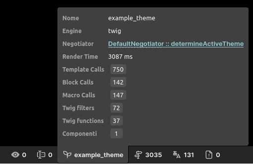
The latest version of the WebProfiler module (10.1.1) offers full support for collecting and exploring the components used on a page.
On the WebProfiler toolbar, a new counter has been added to the theme widget, showing the number of components used on the page:

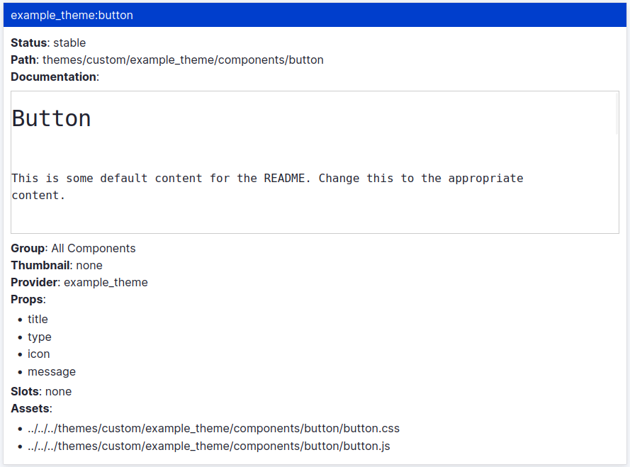
Clicking on the counter will open the WebProfiler dashboard, showing all the components used on the page:

At the time of writing, a core patch is required to enable this feature; be sure to apply it before enabling the SDC module.
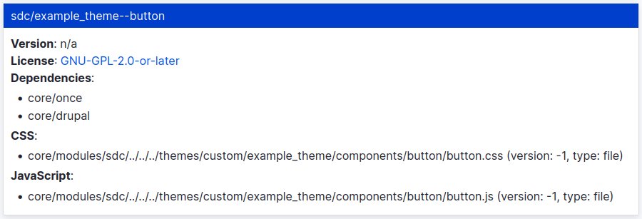
Another new feature is the ability to explore the list of libraries used on the page (under the Asset data collector). As SDC automatically declares a library for each component, you can use the new pane to find the one used by the button component:

Conclusion
SDC is becoming the de facto standard for building Drupal components, with emerging modules (like No Markup and Single Directory Components: Display) and best practices. More will come in the future.
In this article we have just scratched the surface of this new feature, to learn more we recommend you to read the just published Modernizing Drupal 10 Theme Development book.

In the book you’ll find a detailed explanation about how themes work in Drupal 10, how to use SDC, how to integrate with tools like Browsersync and Backstop.js and how to expose your work to frameworks like Storybook.
