UX and Sustainable Web
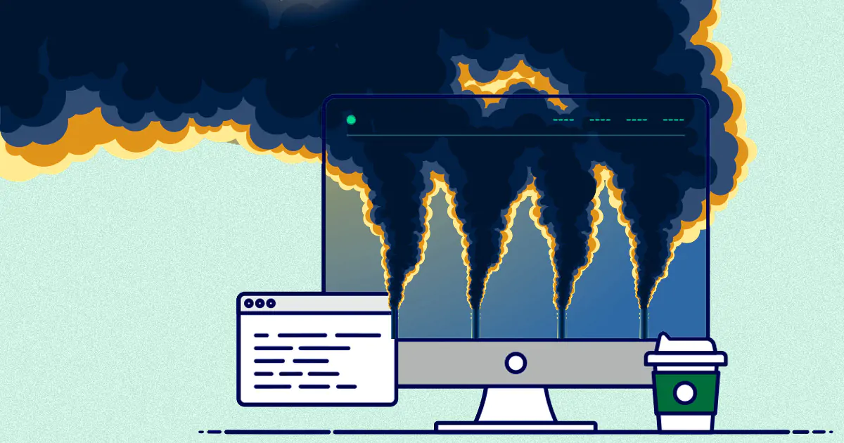
Sustainable web design considers parameters like speed, performance and usability: all three make users happier and satisfied. So, why is the Internet responsible for 4% of total CO2 emissions?
Disclaimer: Our Tech Blog is a showcase of the amazing talent and personal interests of our team. While the content is reviewed for accuracy, each article is a personal expression of their interests and reflects their unique style. Welcome to our playground!
Introduction
If the Internet was a country, it would be the 4th largest polluter.
This is the opening sentence of the Sustainable Web Manifesto, a collaborative project officially launched in 2019 by Wholegrain, a London-based agency whose specialty is the development of sustainable websites. When I first read this sentence, I was a bit shocked and curious at the same time. It was eye-opening.
But, is Internet the real enemy?

We will start this journey with some data, then we’ll talk about what we can do to reduce the emissions of our websites and applications and at the end we will answer THE question: does a more sustainable UX have all the features the users are already looking for?
Let’s start with some data
- Internet is responsible for about 4% of total CO2 emissions;
- A single Google search produces a minimum of 1g to a maximum of 10g of CO2;
- On average, Google processes about 47.000 searches every second, which means about 3.5 billions a day;
- Websites emits an average of 1,76g of CO2 for every page that’s visited.
These numbers may not mean much to you, so let’s have a look at some data regarding more tangible activities:
- Transport is responsible for about 8% of total CO2 emissions;
- Air traffic is responsible for about 2% of total CO2 emissions;
- Smoking a cigarette emits 14g of CO2;
- An active freezer emits 40g of CO2 every hour.
You thought that 4% was a small and irrelevant percentage, did you? Well, let me rephrase: Internet CO2 emissions are twice as much as air traffic emissions and if we consider the worst-case scenario, a single Google search emits as much as smoking a cigarette. Not to mention that Internet is becoming more and more present in our daily life. From buying groceries to entertaining ourselves with some streaming content to even work, that 4% data is estimated to increase.

What does it mean to design sustainable websites?
Sustainable websites follow the six principles declared in the Sustainable Web Manifesto. They are the following:
- Clean, websites should be powered using clean resources;
- Efficient, we should use the least amount of energy and resources and re-use components whenever it’s possible;
- Open, websites should be accessible and clear for our users;
- Honest, this one is linked to the previous principle and aims to specify that websites should not take advantage of the users;
- Regenerative, our websites provide an opportunity to support greener choices such as accepting a longer delivery when we buy a product or compensate emissions by planting trees;
- Resilient, our websites should work even at difficult times and conditions.
Starting from these principles we can define some best practices.
Green Web Hosting
The first one is linked to the first principle (clean) and it’s about the hosting: we should choose a green hosting provider that uses renewable energy to power its servers. Some of them can be found in the following list provided by The Green Web Foundation. If you want to, you can also check whether your website or a website you’re interested in is hosted on a green server by using the Green Web Check.
Web Performance Optimization
A sustainable website is also a performant website: in these terms, sustainability equals speed. This is because the slower a website is, the more energy it consumes. A slow website leads to the worst-case scenario when we talk about sustainability and UX:
- users try to navigate a page of our website
- the page requires some time to load
- the page requires some more time to load
- users close the page without even interacting with it.
Why is it the worst-case scenario? Because it takes a various amount of resources to load a website, and if the user closes the page before the end of the loading process, all the resources that have been downloaded are wasted and with them also all the energy required to do so.
Content findability
We should ensure that users find the content they seek in the easiest and fastest way possible. This is because if users can’t find what they are looking for, they will probably try to find it somewhere else either clicking on various links in the same website or in a new one and consume more energy.
Usability
We should ensure that our websites are usable and efficient on different devices, browsers and bandwidths.
Practical tips
There are so many elements that can be managed to make our websites more sustainable but in this article we will cover only three of them: images, fonts and videos.
Images
Images are one of the main elements used in our websites to communicate something or visually represent a concept. However, images are resources that need to be loaded therefore require some energy dependent on their colors, size, etc. We as designers and developers need to ask ourselves some questions: is this image really needed here? Does it add something useful for the user? Is it accessible so that everyone can benefit from adding it to our website?
If the answer to all the questions is yes, then we can apply some strategies to reduce the carbon footprint of our image. The main thing is to use a sustainable-friendly format whenever it’s possible and my recommendation is the .webp format. The .webp format was developed by Google specifically for images that would be used on the web and it is optimized to enable faster and smaller images.
Webp lossless images are about 26% smaller than png images whereas webp lossy images can be a minimum of 25 and a maximum of 34% smaller compared to jpeg images.
Here you can find further explanation about the compression technique that backs up this format.
Fonts
The most sustainable fonts are of course system fonts because they are already installed in any user’s device and do not need to be downloaded. However, at this point you may be wondering: what about creativity? What about branding? System fonts are very neutral.
In fact, there are services like Google Fonts or even Adobe Fonts that come to help us with this problem. Google Fonts, for example, includes more than 1300 font families and maintains more than 30 optimized variations of each font. Google also provides the most efficient resource whenever we call one of its fonts.
The third option, the most creative one, is obviously using a custom font. In this case, we should use formats that provide the best compression such as EOT, TTF, WOFF and WOFF 2.0.
Videos
Videos are one of the most energy-consuming elements of our websites. Therefore, we should use them only when essential: they should enhance the user experience. It’s best to reduce the number of videos on our website and minimize their duration to their purpose only.
Video & Autoplay
Yes, we will talk about one of the worst things that can happen to a user: autoplay. Autoplay is a feature that is still very much used in some websites, especially news websites, that’s why I decided to include it in this article.
It annoys users because it takes away their control over the content they are consuming and users want to be in control of what they are doing and what they are seeing. Autoplay is the digital equivalent of a salesperson that comes to you at the entrance of the store to ask if you need something of if they can help you, and you’re like this:

Not appreciated at all, right? For people with disabilities this feature can be even more problematic because:
- it can be difficult to understand where the sound is coming from;
- it can get in the way of screen readers and make it difficult to navigate the website;
- it can cause physical reactions such as seizures due to the content.
The user is obviously forced to close the page, and we’ve already seen that this is the worst-case scenario: think about all the resources that have been downloaded and wasted because of a pointless feature.
So, here’s what we can do:
- remove autoplay;
- add play/pause buttons so that users can manage the video as they prefer;
- add usability options and warnings about the content;
- add subtitles so that users can understand the content even if they can’t hear it.
At this point you may be wondering: why are we talking about accessibility? Isn’t this article about sustainability? Well, the answer is simple: accessibility is sustainability. Sustainable strategies and principles aim to include as many as users possible because only when everyone will be able to access the content of our website then the resources required won’t be wasted.
Conclusion
So, is a more sustainable UX really needed? Spoiler alert: yes.
We’ve seen through this article that sustainable choices indirectly lead us to what users are looking for, and that is: performant, accessible and usable websites.
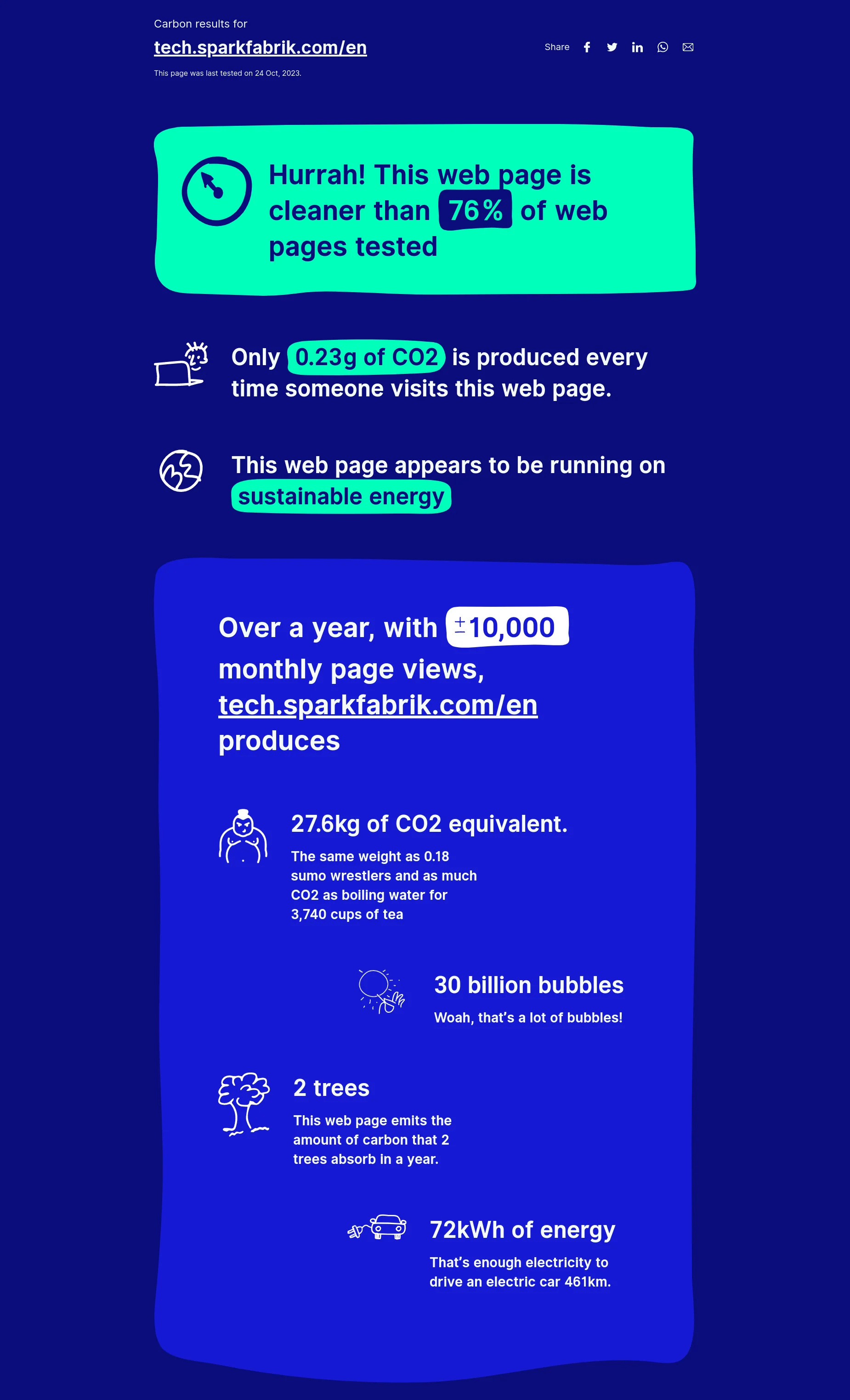
Today users also tend to choose more sustainable products and services therefore it’s a good practice to add some information about the sustainability of our website. There are various tools that can help us with this task such as Website Carbon. It requires an url and then returns information such as the amount of CO2 produced everytime someone visits the page, whether the website is running on sustainable energy or not, some tangible equivalents of the amount of CO2 produced over a year with a fixes amount of page views, etc.

Let me close this article the same way it started: with a quote.
The internet should be a public good - healthy for the planet and for the people who use it.
References
- The real climate and transformative impact of ICT: A critique of estimates, trends, and regulations
- EDGAR - Emissions Database for Global Atmospheric Research
- Air travel emissions and some data
- Carbon Footprint of the Internet Over Time Since 1990
- Some more tips about images
- Why Autoplay Is an Accessibility No-No
