Drupal Front-End Optimization
The optimization best practices for your Drupal website front-end development
Disclaimer: Our Tech Blog is a showcase of the amazing talent and personal interests of our team. While the content is reviewed for accuracy, each article is a personal expression of their interests and reflects their unique style. Welcome to our playground!
Introduction
You spend time and attention to build a web site with Drupal and then the Lighthouse plug-in assigns to your site a low score… It can be frustrating. This article wants to face up to this issue: Drupal websites performance. A difficult issue especially when your customer has discovered the Lighthouse plug-in and communicates its reports to you daily. We should keep in mind that although Lighthouse shows us real metrics of our website, its suggestions are not always the exact answer we need, more likely they are a valid indication that helps us to understand where our intervention is needed. The Drupal world offers a lot of tools and each of them works in specific scenarios. We are going to see which tools and modules can help a frontend developer to maintain a good performance score while building a new theme on Drupal.
IMAGE OPTIMIZATION
It’s very important to optimise the images since this could be the biggest assets we will provide the user with, if we consider that the use of any CMS is, in fact, out of the developers’ control and completely delegated to the content editors. In addition, the images optimization is something that Lighthouse reports frequently suggesting a “Properly size images” message. For these reasons, the frontend developer is responsible for the images optimisation from the beginning and, luckily, Drupal offers some modules to reach this goal.
PIPELINE OPTIMIZATION
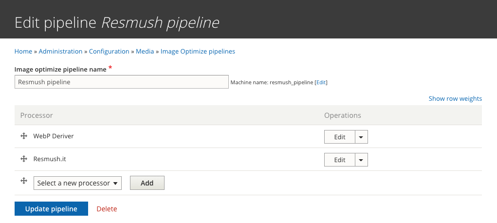
The first module that we are going to see is the Image Optimize pipelines. This module allows us to build up a pipeline of several processes applied to the images in order to perform a first general optimization, removing extra metadata or compressing them.
Specifically, this module allows us to configure one or more pipelines where you can set one or more processes to apply to a website images. There are several processes and you can find them in different modules. For example, there are two processes that we like to use in our projects: the Image Optimize reSmush.it and the ImageAPI Optimize WebP.
Image Optimize reSmush.it
This process is meant to optimize the images of a website providing an integration with the reSmush.it service.
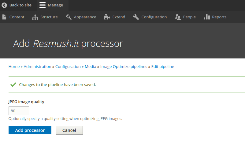
It’s very easy to configure: after you have installed this module, you can go to /admin/config/media/imageapi-optimize-pipelines and click on Add optimization pipeline, select the Resmush.it processor and click add. Lastly you can set the image quality and you can conclude by clicking in the add processor button.

ImageAPI Optimize WebP
This process provides the images created by the source images with a .webp extension in order to have two versions of a styled image. The .webp extension is an image format developed by Google, with the purpose to create files that are smaller in size, but with the same quality. When you add this process to your pipeline, you should pay attention to foreseeing it at the beginning of your pipeline and to having the GD library into your php installation.

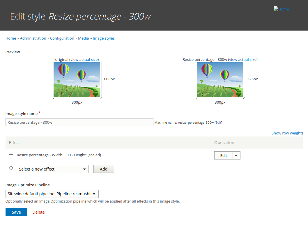
After you have set your pipelines and chosen your default one, it’s necessary to connect them to your image styles.
IMAGE STYLE AND RESPONSIVE IMAGE
After we have configured our pipeline, we can get into our images optimisation with two modules: Image style and Responsive image. We want to edit our images to have the best optimisation for each breakpoint resolution. In fact, we begin by creating the image styles and then we configure them for each breakpoint using the Responsive image module.
The Image style module allows you to modify your image with effects. There are a lot of image effects and you can get more from Image Effects module. Now we don’t care to apply aesthetic effects to our images, our aim remains the optimization of images for different breakpoints.
For example, if the editor-user wants to upload an image of 3000px size, but our settings define a maximum size of 500px on the desktop device and of 300px on the mobile device, what can we do? The front-end developer should create two image styles with Scale and Crop effects or with a Resize effect to get the best optimization for desktop and mobile resolution.

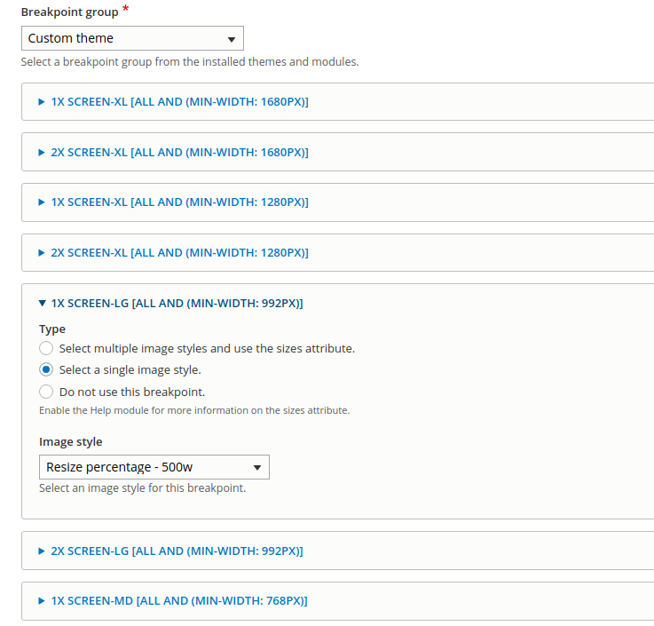
When we have created the image styles for each breakpoint, we should apply these to the responsive image. Basically, the Responsive Image module provides an image formatter and breakpoint mappings to output responsive images using the HTML5 picture tag. Our goal is to associate our Image Styles into the breakpoint mappings.
So, we go to /admin/config/media/responsive-image-style to create a new responsive image style. In the Breakpoint Group selector, choose one group (generally one of your custom themes) and apply the Image style created before to breakpoints, in order to get on the front page a tag picture with two source images.

This was only an example, but obviously the module allows you to add more than two Image styles and you can set more than two breakpoints. As a suggestion, before you can understand how to create a good responsive Image in Drupal, it’s a good idea to have a proper understanding of how HTML5 picture tag works correctly.
LIBRARY ASSETS
If we are talking of the performance of a website, we should obviously discuss of the js assets and the css assets. It’s important to pay attention how to write js/css assets and how many files are present in a web page. In fact, a massive upload of image files can cause slowdowns. Also Lighthouse pays attention to this issue and it displays messages like “Reduce unused JavaScript” or “Reduce unused CSS” to report to us that there is some code that slows down the loading of the web pages.
Drupal helps us to tackle this issue too and allows us to manage the assets for this purpose. Each module or theme in Drupal offers the possibility to create a .library.yml file to define one or more libraries. This is a powerful feature to keep performance in good health. Thanks to the .library.yml file, we can split our assets for components or blocks or elements, ecc…
cuddly-slider:
  version: 1.x
  css:
    layout:
      css/cuddly-slider-layout.css: {}
    theme:
      css/cuddly-slider-theme.css: {}
  js:
    js/cuddly-slider.js: {}
After you have defined your libraries, you can attach them in different ways. Probably you have libraries that should be present in all the pages and that you can import directly in the info.yml file of your theme. Instead, other libraries can be present only if there are specific elements or components and for this reason you can opt to attach them via hook alter or a preprocess or in a file twig.
For example, let’s say you have a file where you styled the table element and that you want to attach this library only if the table element is present you can use a hook alter:
function yourmodule_element_info_alter(array &$types) {
  if (isset($types['table'])) {
    $types['table']['#attached']['library'][] = 'your_module/library_name';
  }
}
Another option can be the preprocess function.
In this example, we define a library with the CSS and JS needed only in the maintenance page and load them only when the website is in maintenance mode.
function yourmodule_preprocess_maintenance_page(&$variables) {
  $variables['#attached']['library'][] =  'your_module/library_name';
}
or can be attach in a twig file:
{{ attach_library('your_module/library_name') }}
<div>Some markup {{ message }}</div>
There are very different ways to attach your library, to discover more I advise you to dive into this Drupal guide.
Once you split your assets, you should aggregate them to avoid having too many file uploads in your web page. To do that, you can go to /admin/config/development/performance and aggregate assets by clicking on two select labels named Aggregate CSS files and Aggregate JavaScript files or if you want a more accurate aggregation, you can use the Advanced CSS/JS Aggregation module.
MINIFY JS
The minification of the assets is always a best practice. There are many different Drupal modules available like, for example, the minify-js module for the file js minification before the aggregation. Moreover, this module is useful to exclude the js files from minification.
Wrap up
We can spend a lot of time discussing how to improve the performance of a website. In this article you find the basics you should pay attention to as a frontend developer when facing Drupal when it comes to managing images.
We also learned how to attach the js/css assets to your website avoiding a unique big asset left unused for many parts of the pages.
Thus, before re-develop to improve a website performance, be agile and develop with optimization on top of your mind. ;)
